817-594-8121
101 College Ave.
Weatherford, TX 76086
“Serving Weatherford and Parker County since 1978.”
File Preparation Tips
Would you like to submit artwork or documents you’ve created yourself for us to print? Here at Quickprint of Weatherford we’re only too happy to work with you to get the best possible print quality from your own files.
Before we can print your file, we need to go over some very critical details that your digital file should conform to, so that you can create the best possible print-ready file, and one that we can easily work with on our computer systems.
File Formats
First, let’s go over some common programs and their file formats that we can work with:
- PDF (Portable Document Format). This has become the universal standard for easy exchange of documents between different computers. It is a true “cross-platform” format, as PDF files can be easily opened on Windows, Macintosh, Linux and Unix computers. You can even open them on your Android or iPhone smartphone. Many commonly used word processing, page layout and graphics programs can export your document in PDF format, and even embed your fonts in the file so that we at Quickprint don’t have to have the same fonts installed on our computers in order to open your PDF file and see it exactly as you intended it to look. This is extremely important, as it can completely change the look of your document on our computers if we don’t have the same fonts that you do, and our computer is forced to substitute one of our installed fonts for the font(s) you used on your computer to create the file. Please remember to embed or subset all fonts into your PDF output. Ask us for help if you feel the need! We’re only too happy to offer help and advice.
Another important factor is the color model you use to create and save your PDF file in. PDF can save files in either the RGB or CMYK color models. We’ll discuss color models in the next section. - EPS (Encapsulated PostScript). EPS is very similar to PDF, although it’s an older and simpler format. We highly recommend using the PDF format over EPS, as EPS doesn’t embed your fonts within the EPS file, meaning that if we don’t have the exact same font(s) installed on our computer, our system will substitute one or more of its installed fonts in place of the fonts you used on yours. The end result is that your file will look different (and print differently) when we open it on our computer. For that reason, we highly encourage submitting PDF over EPS.
- Native formats of any of the Adobe Creative Suite programs: Adobe Illustrator, Adobe InDesign, Adobe Photoshop, etc. It’s important to outline your fonts in some Adobe programs, particularly Illustrator. We recommend doing this on a copy of your work file, because outlining fonts preserves the text visually but renders the text un-editable so that you can’t edit it later. So work on a copy which you will send to us, rather than the original. How to outline fonts in the various versions of Adobe programs is beyond the scope of this article, but you can find many web pages online that explain how to do this. In Photoshop, please rasterize any layers that have text. Again, you should do this on a copy of your work file, so that the original remains editable. As always, call us for help and advice if you don’t understand what we’re talking about here. If you have Adobe Acrobat Pro, you can also export to PDF from the creator program, open the PDF in Acrobat and outline the text by flattening the file, which outlines the text characters and gets rid of transparent areas which can also cause printing problems.
- Common word processor programs: Microsoft Word, WordPerfect, OpenOffice Writer, etc. Word processor files can be really troublesome because they normally can’t embed fonts (actually include the font files) in their native file format. However, most modern popular word processor programs can export to PDF format and embed your fonts as part of the conversion to PDF. Embedding is not as foolproof as outlining fonts, but it is a reasonable workaround. It is important that we open your file on our computer and let you look at it there (or print out a proofing copy) to make sure the correct fonts are showing up and that your text flow and layout hasn’t been altered in any way on our computer, or that any graphical elements (photos, charts, etc.) are missing or altered. Another problem is that most word processor files are only in RGB color model, which can be a problem for accurate color reproduction when printed. See the next section for details.
Color Models
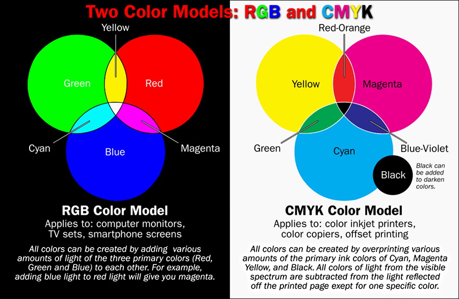
The way color is displayed on your computer monitor is very different from the way color is printed on a piece of paper. Computer monitors (and TV sets and your cell phone display) paint color on the screen using light emitted in the RGB (Red-Green-Blue) color model. The range of colors on the visible light spectrum can be made by combining various intensities of red, green and blue light, called additive color. Color printing, however, uses the CMYK (Cyan-Magenta-Yellow-Black) color model, which is called subtractive color because that ink or toner on the paper filters out all the colors of the spectrum except for the color that you see. Here’s a graphic that illustrates how the two color models work:
The reason we’re taking all this trouble to explain the two color models and why this is important to you is this: if you created your art on a computer, the colors that come out of our printers will be different. How different? Anywhere from not very noticeably different to very noticeable! For example, that brilliant, almost blindingly bright green that you see in the graphic above for RGB color — that green is almost impossible to print out on paper using the standard CMYK colors. In fact, you have to have a special ink mixed (kind of like the way they mix custom house paint colors) just to come close to that green in a printed piece. Colors tend to come out somewhat darker and less vibrant on paper, especially colors in the blue and green range. Reds and yellows tend to reproduce much better. But there are almost always some shifts in hue (color) and value (lightness/darkness). Particularly noticeable is that the skin tones of people can come out much different on paper than what you see on screen. Here’s a graphic which attempts to simulate the kind of color differences you would see between screen and paper:
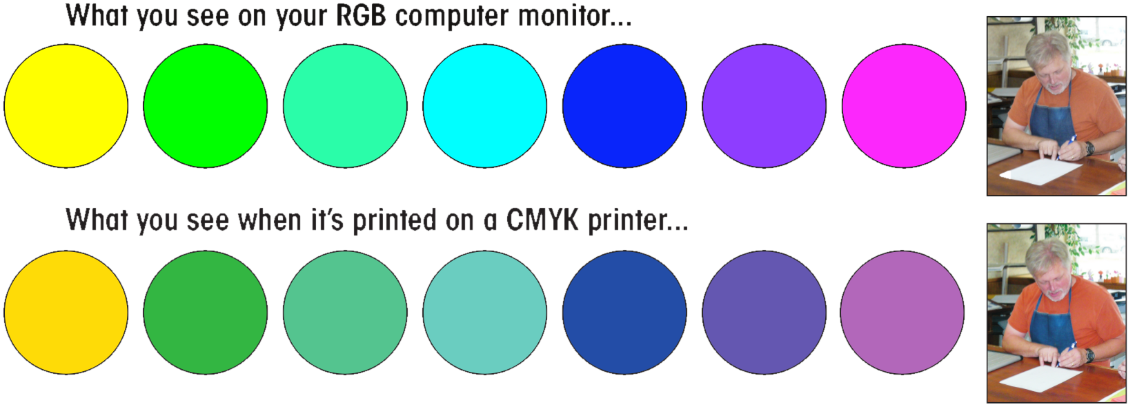
You can see how the printed (CMYK) output is generally less vibrant than what your graphics program or word processor shows on your computer monitor. Notice how your favorite print shop owner’s skin tones go a little too far over into the magenta range on the photos. We folks in the professional printing and graphic arts will employ special equipment and software to do something called “color profiling” to our monitors, digital scanners, and printers, which essentially makes our computer monitor simulate the color output of our printer. We can then adjust color on the photos or art, on our computer, to make your final printed piece more closely match what you want it to look like.
For that reason, if accurate color is critical to the success of your print piece, we recommend that you allow us to build your artwork on our systems, giving us copies of your photos and other graphics to work with and “color balance” on our equipment in the art preparation stage. If you create your art in the same Adobe or Quark graphics programs that we use, then go ahead and create your own art and give us a copy of the native file, which we’ll then open and work from. Whichever way it goes, as the next-to-last step we can then print out a color proof for you to look at to ensure that you’ll be happy with the final product.
Now, you may have some special colors in your piece that are very critical to match. For example, many companies insist that colors in their logo look very close to original specifications when printed.
For those situations, we can make use of custom-mixed colors selected from a color “swatch book,” a process very similar to the way you select custom house paint colors down at the paint store. In the professional graphic arts, the Pantone Color Matching System has been the industry standard for decades. Here’s what a Pantone color swatch book looks like:
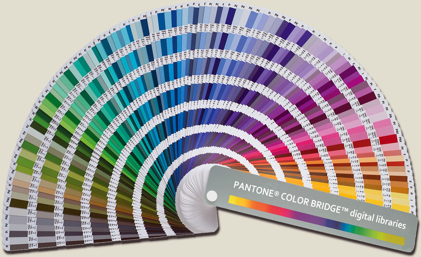
Note that making use of pre-mixed custom colors like this is only available for offset printing on our AB Dick printing presses; we can’t use custom colors in our color copiers or inkjet printers, for example.
Using a swatch book such as this, our customer can simply give us a number(s) corresponding to the color(s) they want to use in their piece, and we can custom mix to order, or order pre-mixed from our supplier. With a system like Pantone’s, you can be sure that what comes off our printing press is extremely close to the color(s) you chose out of the swatch book. The main variable in this case is the relative whiteness of the paper you print on. The whiter the paper, the better the printed color matches that in the swatch book. Colored or off-white paper will affect the hue of all inks printed on that paper, so if color matching is critical on your job, go with the whitest paper stocks.
Bleeds
What is a bleed?
In printing terminology, the bleed is the extra margin on a print product that is meant to be trimmed off when the product is trimmed to its final size. Bleed basically means that the color and graphics on a product "bleed off the page" to ensure continuity of the color to the edge of your product.
When we print products such as business cards and postcards, we do not print on paper of that size. We organize several images next to one another on a large sheet of paper, print, and then trim each individual product to its final size. Jobs cannot be trimmed perfectly on the trimming line every time. During the trimming process, a product may be trimmed within or beyond the trimming line. As a result, the product may have a white edge, or a portion of the artwork from the adjacent image if there is no bleed. Thus, we require a bleed so that when the product is trimmed, there is an extra margin to prevent imperfections. It requires more cutting, but gives a better quality product.
For the correct bleed for your product, please view the list below. For example, most business cards have a 1/8“ bleed on each of 4 edges, so a 2” x 3.5” business card will have a bleed size of 2-1/4” x 3-3/4”.
1/8” (.125”) Bleed: most business cards, folded business cards, bookmarks, CD packages, club flyers, collectors cards, DVD packages, event tickets, most postcards, rack cards, rip business cards,rolodex cards, stickers, table tents, greeting cards, “wink” special shapes.
1/4” (.25”) Bleed: Brochures, door hangers, envelopes, flyers, hang tags, letterheads, menus, notepads, posters, banners, posters, window decals and yard signs.
The Safe Zone
What is the Safe Zone?
The Safe Zone is the area where all the critical elements (text, images, logos, etc.) must stay within, so that they are not trimmed off when the product is trimmed to it’s final size. Please make sure to keep important elements within the Safe Zone, as elements outside may be cut off or end up too close to the cut edge during trimming.
The Safe Zone for business cards is 1/8” from the edge. On brochures, flyers, etc., the Safe Zone is 3/16” to 1/4”. Try to keep text, logos, etc. within this area. Background images and photos that “bleed” are not included and can go past the Safe Zone.
So for a standard business card, the Bleed Size is 3.75” x 2.25”, the Safe Zone is 1.75” x 3.25” and the finished size is 3.5” x 2”.
Finished Product Sizes
These are the standard finished sizes for different printed products…
Business Cards: 3.5” wide by 2” high
Letterhead: 8.5” wide by 11” high
Legal Size: 8.5” wide x 14” high
Envelopes: Standard business size (#10) is 9.5” wide by 4.125” high
Flyers: 8.5” wide by 11” high
Brochures: Standard size is 11” wide and 8.5” high. Remember, the three panels on a brochure are not the same width. The front panel (when folded) and the middle panel, is 3-11/16” wide and the last panel that is tucked inside is slightly narrower at 3-5/8” wide. This keeps the brochure laying flat after folding. Also remember the panel layout is reversed when laying out the inside.
Rack Cards: 4” wide by 9” high
Door Hangers: 3.5” wide and 8.5” high or 4.25” and 11” high. Other sizes are available. Be sure to allow space at the top for the die-cut doorknob hole.
Notepads: Quarter-sheet size is 4.25” wide by 5.5” high and the half-sheet size is 5.5” wide by 8.5” high. Full size is 8.5” wide by 11” high.
Small Posters: 11” wide by 17” high
Large Posters: 24” wide by 36” high or the larger 36” wide by 48” high. Other custom sizes are available.
Christmas or Greeting Cards: Standard size is 5” x 7” for flat cards or 10” x 7” scored to fold in half to 5” x 7”. We carry envelopes to fit this size.